I got a TON of positive feedback on my flag ranking article a few weeks back. It became my most viewed article ever, and people were asking for similar articles in the future. So, I decided to go through and rank my favorite minor league baseball logos and team names. These teams are famous for getting really creative, adding more variety than you typically see in sports. For this ranking I did my top 5 for each level, with my 5 overall least favorite at the end. So while there are 20 top logos picked, it is not necessarily an overall top 20. The 6th best AAA logo might be cooler than the 5th best A logo, but for the purposes of this exercise the AAA team would not make the cut while the A team would.
When determining which MLB team had the coolest overall group of affiliates, it was easy to narrow the list down to the only three teams that had two affiliates make my top 20, namely the Giants, Braves, and Angels. From there, it was even easier to settle on the Atlanta Braves as the team with the best overall farm system branding. They just don’t have a single miss with any of their four affiliates.
For worst overall affiliate branding, anyone with eyes and half a brain can see that the Chicago Cubs take the cake. Two out of their four teams are just called the Cubs, and none of the four have anything resembling a cool name, mascot, or logo. I was very disappointed to see this from one of baseball’s most beloved teams.
The best overall MLB division when it comes to affiliates would have to be the American League Central. They are the only division where all five teams were able to snag one affiliate in my top 20, and none of their affiliates made my least favorites. The worst division would have to be the National League Central, where the Cardinals join the Cubs as some of the worst of the worst, and only one affiliate out of the 20 in the division makes my list of winners.
In terms of my level rankings, AAA and A+ both have great brands across the board, and it was really difficult to narrow down my top 5. Meanwhile, AA and A are both far more bland from top to bottom. So, my ranking in terms of team quality would have to go AAA, A+, AA, then A.
One final thing to note is that a lot of these teams have alternate logos, but for the purposes of this ranking I used only the official logo listed on MiLB.com. Without further ado, please let me know where I am right and where I am wrong!
=
AAA Favorites:
Sugarland Space Cowboys (Houston Astros)
Forget Minor League Baseball, this might be the coolest branding in the history of the universe. The alliteration on the S in the team name is very satisfying, and this logo is a thing of beauty. It perfectly combines the two themes with the cowboy hat and kerchief paired with the space helmet in between. The stars in the face perfectly evoke the wonder of outer space in the most dramatic way possible. Just an absolute artistic masterpiece.
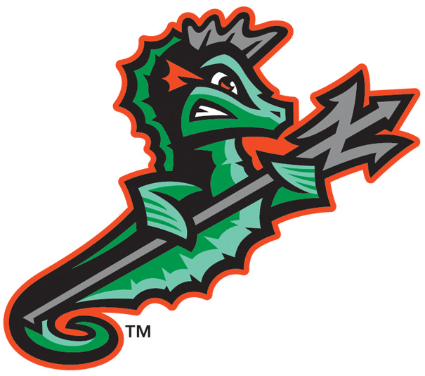
Norfolk Tides (Baltimore Orioles)
The Tides is a pretty cool name, but they could have easily just thrown a wave on their hats as a logo and called it good. Instead, they chose a grimacing seahorse charging into battle with a trident, which is an incredibly awesome decision. The green and gray ringed with orange is a surprisingly satisfying color combo as well.
Lehigh Valley Iron Pigs (Philadelphia Phillies)
This logo is exactly the type of thing that makes the minors special. If it was a pro team, they would just be the pigs. Instead, they become the iron pigs, adding several bars of iron to the pig’s face like the world’s coolest mask, greatly increasing the ferocity of the logo. This is very well done.
Albuquerque Isotopes (Colorado Rockies)
Isotopes is one of the most creative names out there, as you don’t see many science themed mascots, and it flows nicely with the city name. Furthermore, the logo effectively conveys the sense of atoms whirling about in some fancy experiment. This is one of the more simple logos on this list, but it really works for me.
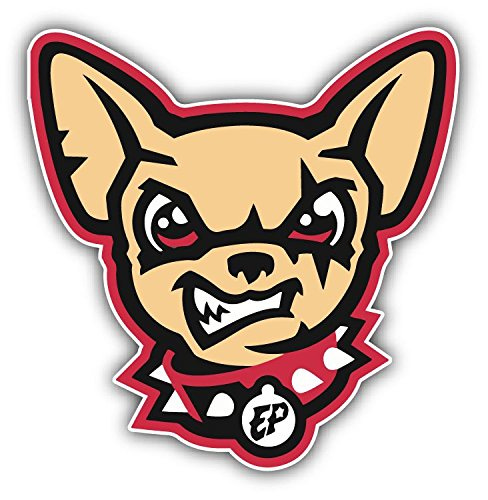
El Paso Chihuahuas (San Diego Padres)
We stay in the Southwest here with the Padres affiliate. I appreciate them paying respect to their heritage with this Mexican dog breed, and why not give it a spiked collar, a fearsome growl, and a few battle scars? I wish more teams would be willing to turn harmless mascots into something tough. Imagine if the New Orleans Pelicans, for example, turned their logo into a bird of prey? Follow this example!
=
AA Favorites:
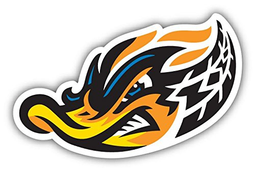
Akron Rubber Ducks (Cleveland Guardians)
In another textbook example of minor league ingenuity, the relatively common duck is here combined expertly with the idea of burning rubber in a lightning fast sports car. The design of the flames and tire marks effectively convey high speeds, as if that duck bill might pierce your heart at a few hundred miles an hour. I am a big fan of this logo.
Richmond Flying Squirrels (San Francisco Giants)
Similar to the Chihuahuas, I have a ton of respect for how cool they make this commonplace animal look. The red and black coloring evokes a sense of mystery and power, and the full extension of the arms makes me think of the base jumping scene in the Point Break remake. The acorn and R in the shape of fur on the chest is a subtle yet effective finishing touch.
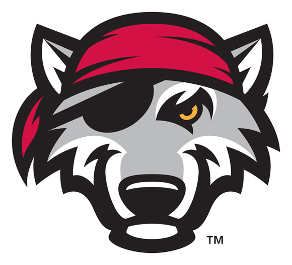
Erie Seawolves (Detroit Tigers)
What if a wolf was also a swashbuckling pirate? Sign me up! The combination of these two relatively common mascot ideas is very neat, and despite the simplicity of the design I think it is well executed. Eerie also gets creative with their Seawolf and special events, such as throwing Uncle Sam’s top hat on him for the Fourth of July.
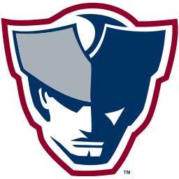
Somerset Patriots (New York Yankees)
This will no doubt be a controversial selection given that the Patriots is a relatively common mascot, but I love this logo. Whereas most Patriots logos look like your typical eighteenth century soldier, this guy looks like a spy for the British who has been forced to give up his moral code for the good of the cause. Or perhaps a soldier who comes out of retirement to go on a rampage of war crimes after his family was taken captive (now that I think about it, that is just the plot of the Mel Gibson movie “The Patriot”). Regardless, I think it’s safe to say that you don’t want to mess with this Somerset Patriot. He has been through a lot.
Rocket City Trash Pandas (Los Angeles Angels)
Probably the most famous minor league logo of all, this is a chalky pick that I am lower on than most, but I would be remiss not to include them in my top 5. The logo effectively conveys all three elements of the name with the rocket, the trash can, and the panda, and it is a satisfying design. The alliteration with “Rocket City Racoons” was right there, but I respect the move to go with the animal’s nickname instead, as it adds a sense of colloquial endearment to the team.
=
A+ Favorites:
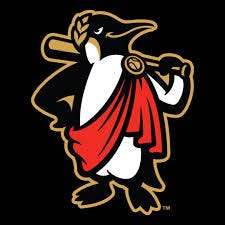
Rome Emperors (Atlanta Braves)
Three perfectly executed puns in one brand is a sure way to get yourself a one way ticket to the top spot. First, we have the Emperor name which is a pun on the city of Rome, then we have a pun on the traditional Roman Emperor mascot by combining it with an Emperor Penguin. The graphic designer of this logo deserves a medal as well. Doesn’t this guy look like he is about to banish some of his rebellious Artic subjects to the penguin equivalent of the Coliseum before hitting some bombs off of his servants that are required to toss him softballs but pretend that they are trying to strike him out? I love everything about this branding.
Hillsboro Hops (Arizona Diamondbacks)
This team has some of the most satisfying alliteration in all of the minors in their name, and it is really unique to use a niche yet widely appreciated grain as a mascot. Who doesn’t love an ice cold beer at the ballpark, after all? I also love how they turned the hop into a sort of troll like figure with only a few subtle design choices. This is just a textbook example of what makes minor league branding great.
Eugene Emeralds (San Francisco Giants)
If a major league team had this name, they would probably just pick some ambiguous green shape to be their mascot. Instead, the Emeralds go with a massive Bigfoot preparing to stomp on an opponent, and maybe club you with a redwood tree while he is at it. This logo really evokes the nature loving spirit of the Oregon people, as well as the deep green forests and grasses that only the Pacific Northwest can produce.
Wilmington Blue Rocks (Washington Nationals)
I really love this shade of bright blue that Wilmington went with. Blue can be a redundant color in a lot of logos, but this strikes me as a unique and attractive version. This moose is clearly ready for battle, but he also does it with a smile, as if he will enjoy running up the score. This logo just brings a smile to my face every time I see it.
Quad City River Bandits (Kansas City Royals)
Do I just really like racoon puns? It is possible, but this one adds a local flavor by referencing the mighty Mississippi River which runs through the city of Davenport, Iowa. I have never really though about the black around a racoon’s eyes looking much like a mask, until I saw it in this design, where the creature looks like a proper stagecoach robber of the Wild West.
=
A Favorites:
Kannapolis Cannon Ballers (Chicago White Sox)
I really like this logo. The mustache is top tier, and you can tell that this mascot is not some hack adrenaline junkie, but a seasoned professional stunt man. It would have been easy for Kannapolis to go with a traditional military cannonball look, but I am glad they didn’t as this design is way cooler.
Fort Myers Mighty Mussels (Minnesota Twins)
Much like the Rome Emperors, I love a good a good double pun team branding. Throwing massive muscles on this mighty mussel makes it more than magnificent, and the purple and yellow coloring fits with the silly theme. I have a feeling that this mascot would have put Mark McGuire’s stats to shame in the steroid era, and he would have looked good doing it.
Daytona Tortugas (Cincinnati Reds)
This is another pretty simple logo, but I love the decision to throw a little Spanish into the team name. Also, something about the design of the turtle really speaks to me. He looks like a 15 year MLB vet who has never made an All-Star appearance or gotten on ESPN Top Ten Plays, but has quietly produced a .375 on base percentage throughout his career. Just a guy who goes about his business the right way.
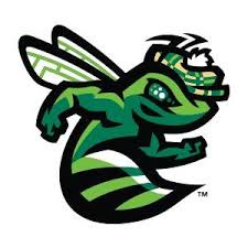
Augusta Green Jackets (Atlanta Braves)
The Masters pun writes itself, but I love how they turned it into their own fictionalized version of a yellowjacket. The golf cap is a nice touch, and the detail on the bug’s eyes are incredibly thorough. This affiliate may have been born on third base with their location, but they crossed home with style.
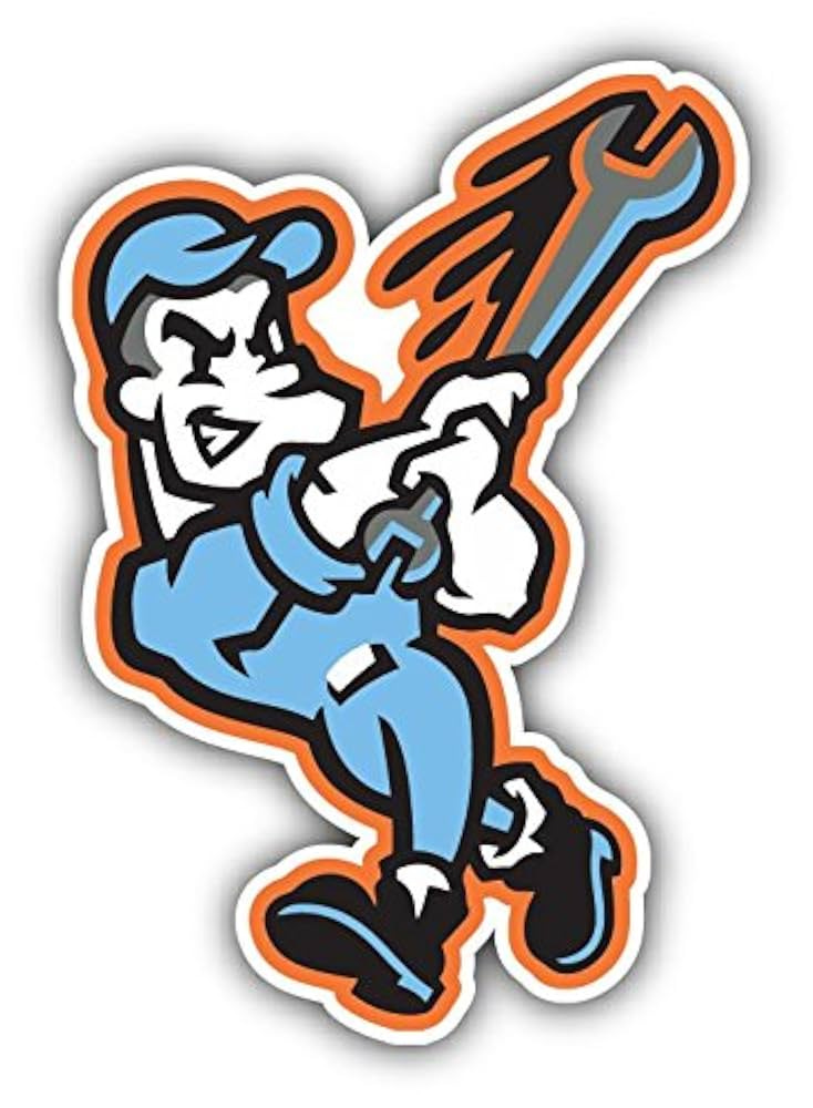
Inland Empire 66ers (Los Angeles Angels)
This logo and team name is a reference to the famous Route 66, a major historic highway which runs through this team’s hometown of San Bernadino, California. I think that it is clever and well done, and similar to the Norfolk Tides of AAA I am a sucker for a good orange ring around a logo. The Angels pay proper homage to their roots with this branding.
=
Least favorite brandings:
Salem Red Sox (Boston Red Sox A)
Salem just copied the mascot of their major league affiliate, but somehow made the logo even more boring. This team gets an F- from me.
Iowa Cubs (Chicago Cubs AAA)
Shameless plagiarism of the MLB logo, and from a AAA team no less? What a joke.
Palm Beach Cardinals (St. Louis Cardinals A)
In addition to the obvious copying factor, the letters of this logo are the most bland, worthless designs in the entire MLB farm system. This is about as lazy of a branding as you can get.
Lake Elsinore Storm (Padres A)
The Storm name is fine I guess, but what is with the eyes? How are they in any way related to the mascot? They are not even particularly well designed either. This one is just too weird and random for me.
Chesapeake Baysox (Baltimore Orioles AA)
I actually kind of like this team name, and those of you who know me personally know that I can’t resist the color orange, but this logo design just really disappoints me. It looks like it came straight out of the 1990s, or was made by someone who just learned how to use a computer for the first time.


